
Welcome to the third installment of our blog series, “Exploring the Evolution of Websites,” brought to you by Chico Web Design!
Amazon’s website has undergone significant changes since its inception, reflecting the company’s evolution from an online bookstore to a global e-commerce and technology giant.
This case study illustrates how websites adapt and grow in functionality, design, and user experience to meet changing market demands and technological advancements.
By examining Amazon’s website progression, we can learn valuable lessons in scalability, user-centric design, and the integration of innovative features that keep users engaged and satisfied.
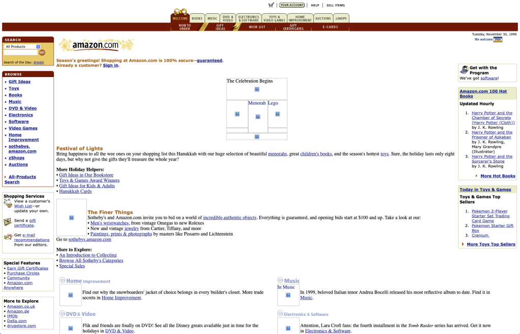
1999 – The Beginnings of Amazon:
In 1999, Amazon’s website had a very basic and static design. The website featured a simple layout with a white background, minimal graphics, and a basic navigation menu. The logo was prominent at the top of the page, and the site primarily focused on text-based links and product descriptions.
The layout had a holiday theme for Christmas, with temporary design elements embellishing “Gift Ideas.” The site looked cluttered, with four different navigation bars and links down both the left and right sides of the page. Tabs were being used for one of the navigation bars.
During this time, HTML was the main technology used to build websites, with basic CSS for styling. The focus was on delivering content rather than aesthetics, as internet speeds were slow and users preferred quick loading times over visual appeal.
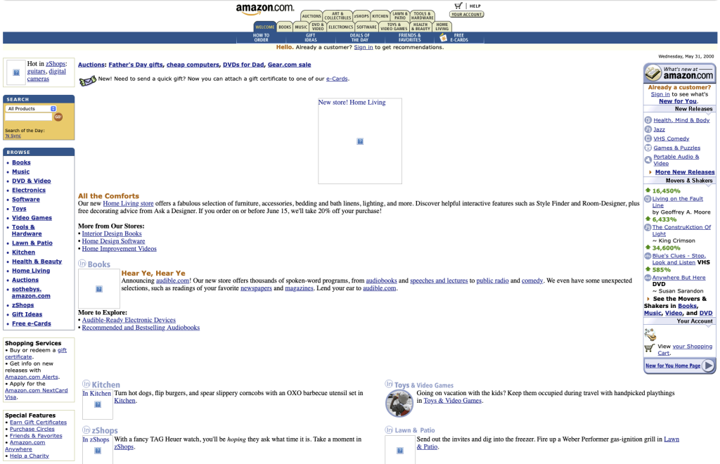
2000 – Early Improvements:
By 2000, Amazon made some improvements to its website. The holiday theme was gone, replaced by a more streamlined design. The colors became slightly more vibrant, with the addition of a light blue background for headers and sections.
The navigation menu expanded significantly, now featuring two full sets of tabs at the top of the site. The layout was filled with links, with links down both the right and left sides of the page and many other links throughout. The entire page was practically a full page of links, aiming to cover as many categories and products as possible.
The layout remained left-aligned, and the overall design was still static, relying heavily on HTML and basic CSS. This period saw the beginning of e-commerce growth, and Amazon started to refine its user interface to improve the shopping experience.
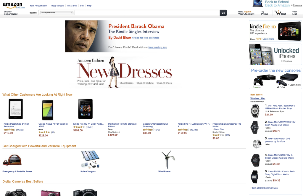
2006 – Dynamic Advancements:
In 2006, Amazon’s website took a significant leap forward with the introduction of dynamic web design elements. The layout became more structured, with clear sections for different categories and featured products.
The navigation system was improved, offering dropdown menus and a more intuitive user experience. Tabs in the navigation bar slimmed down significantly, reducing clutter and improving accessibility. The color of the header bar became more dynamic, incorporating a gradient for a modern look.
Additionally, more ads were introduced on the site, leveraging better targeting capabilities to enhance the user experience and increase revenue.
The design started to use more advanced CSS for styling and JavaScript for interactivity. This period marked the shift towards a more engaging and user-friendly interface, aligning with the increasing complexity of e-commerce operations and the growing expectations of online shoppers.
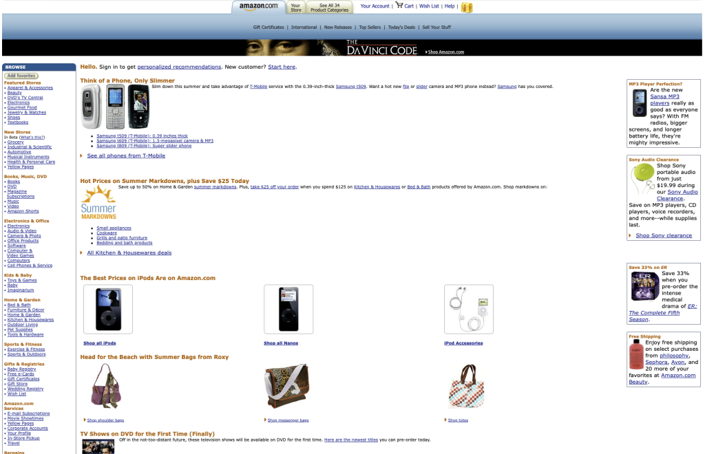
2009 – Enhanced User Experience:
By 2009, Amazon continued to enhance the user experience by incorporating AJAX technology, which allowed for asynchronous data loading without refreshing the entire page. This made the site more responsive and interactive.
The design was cleaner, with a focus on usability and ease of navigation. The color scheme was updated to include more shades of blue and yellow, creating a more visually appealing interface.
The logo remained consistent but was slightly modernized to keep up with contemporary design trends.
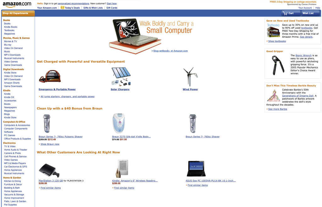
2013 – The Move to Responsive Design:
In 2013, Amazon adopted responsive web design principles to cater to the growing number of mobile users. This ensured that the website would adapt seamlessly to different screen sizes and devices, providing a consistent user experience across desktops, tablets, and smartphones.
The layout became more flexible, with fluid grids and scalable images. The navigation menu was streamlined, and the overall design was more minimalist, with an emphasis on content over clutter. The site was stripped of a lot of it’s color and the long lists of links on either side of the site have been relocated or taken off.
HTML5 and CSS3 were the primary technologies used, allowing for more advanced styling and functionality.
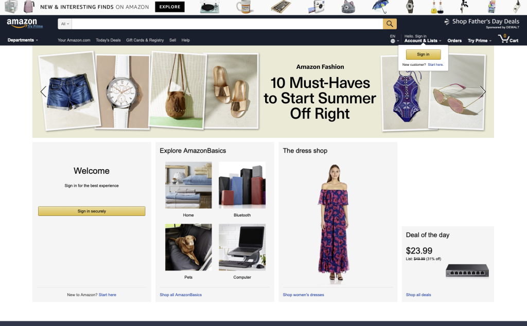
2017 – Personalization and Advanced Features:
By 2017, Amazon’s website featured advanced personalization and interactive features. Leveraging data analytics and machine learning, Amazon was able to deliver targeted content and product recommendations to users.
The design became more dynamic, with interactive elements such as carousels, sliders, and hover effects. The color scheme was updated to include a darker header with white text for better contrast. The overall layout was more organized, with a focus on simplicity and user engagement.
JavaScript frameworks like React and Angular were used to enhance the site’s functionality and performance.
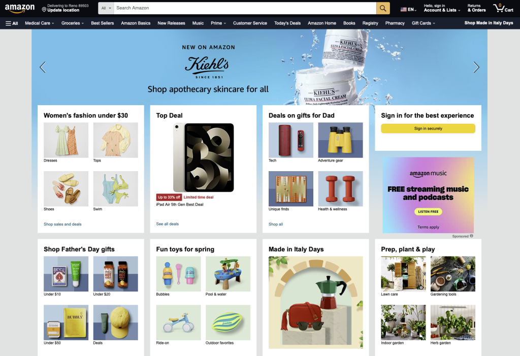
2024 – Cutting-Edge Technology:
In 2024, Amazon continues to leverage the latest advancements in technology and design. The website integrates artificial intelligence, augmented reality, and other cutting-edge technologies to deliver immersive shopping experiences.
The site features personalized recommendations, interactive 3D product views, and virtual try-ons. The logo and color scheme have been subtly refined to reflect a modern aesthetic, with a mix of navy and brighter blue for the header.
A chat bot is present to assist shoppers, and a small ad spans the width above the header, providing prime real estate for advertising. The overall design is clean, intuitive, and highly functional, catering to the needs of today’s tech-savvy consumers.
The technologies used include advanced AI algorithms, AR/VR integration, and progressive web app (PWA) frameworks.
Through each stage of its evolution, Amazon’s website has adapted to meet the changing needs and expectations of consumers, reflecting the broader trends in web design and technology. From static pages to dynamic e-commerce platforms to personalized, omnichannel experiences, Amazon’s digital journey is a testament to the transformative power of web design in shaping the future of retail.
As technology continues to evolve, it will be fascinating to see how Amazon’s website adapts and innovates to stay ahead of the competition and provide exceptional user experiences.
Join us on this journey as we uncover the past, present, and future of web design and technology, one website at a time.