In our ongoing exploration of the Evolution of Websites, we delve into the digital evolution of one of retail’s powerhouses: Best Buy. As we journey from its inception in the late 1990s to its present-day prominence, we witness the remarkable transformation of Best Buy’s online presence, a testament to the dynamic nature of web design and technological innovation.
Through each era, from the early days of the internet to the cutting-edge advancements of today, Best Buy’s website serves as a microcosm of the broader trends shaping the digital world. Join us as we unravel the intricacies of its evolution, uncovering the key milestones and technological breakthroughs that have propelled Best Buy to the forefront of digital retail.
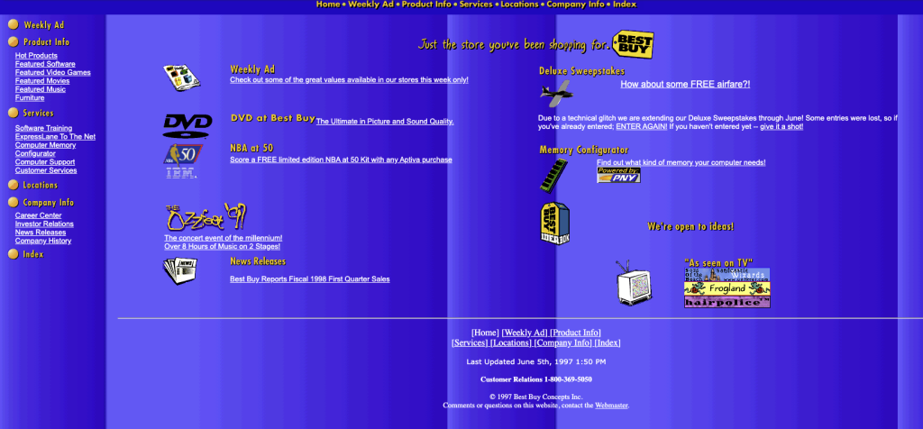
1997 – The Dawn of Online Retail:
In its infancy, Best Buy’s website exuded an unmistakable charm with its quirky gradient colors and a distinctly homemade feel. However, the site’s design left much to be desired, with a small, almost unnoticed logo and text that was challenging to read.
Despite its humble beginnings, this early version of the website laid the groundwork for Best Buy’s digital journey, marking the beginning of its foray into the world of online retail. Built using basic HTML and CSS, with minimal use of JavaScript, the site represented the cutting edge of web technology at the time.
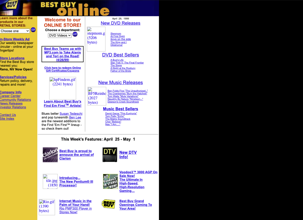
1999 – Embracing Dynamic Elements:
As Best Buy’s website evolved, noticeable improvements were made in its design. The colors became more refined, offering a more visually appealing experience for users. Additionally, the logo found its new home in the top-left corner of the page, a layout choice that has become standard in website design.
However, the logo remained small and somewhat challenging to read, indicative of the design constraints of the time. The website maintained a left-justified position on the screen, reflecting common design practices of the era. Built using HTML and CSS, with occasional use of JavaScript for basic interactivity, the site continued to push the boundaries of web technology in the late 1990s.
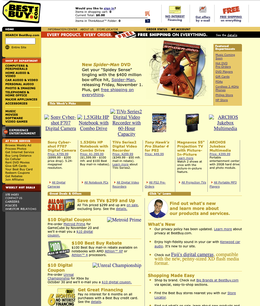
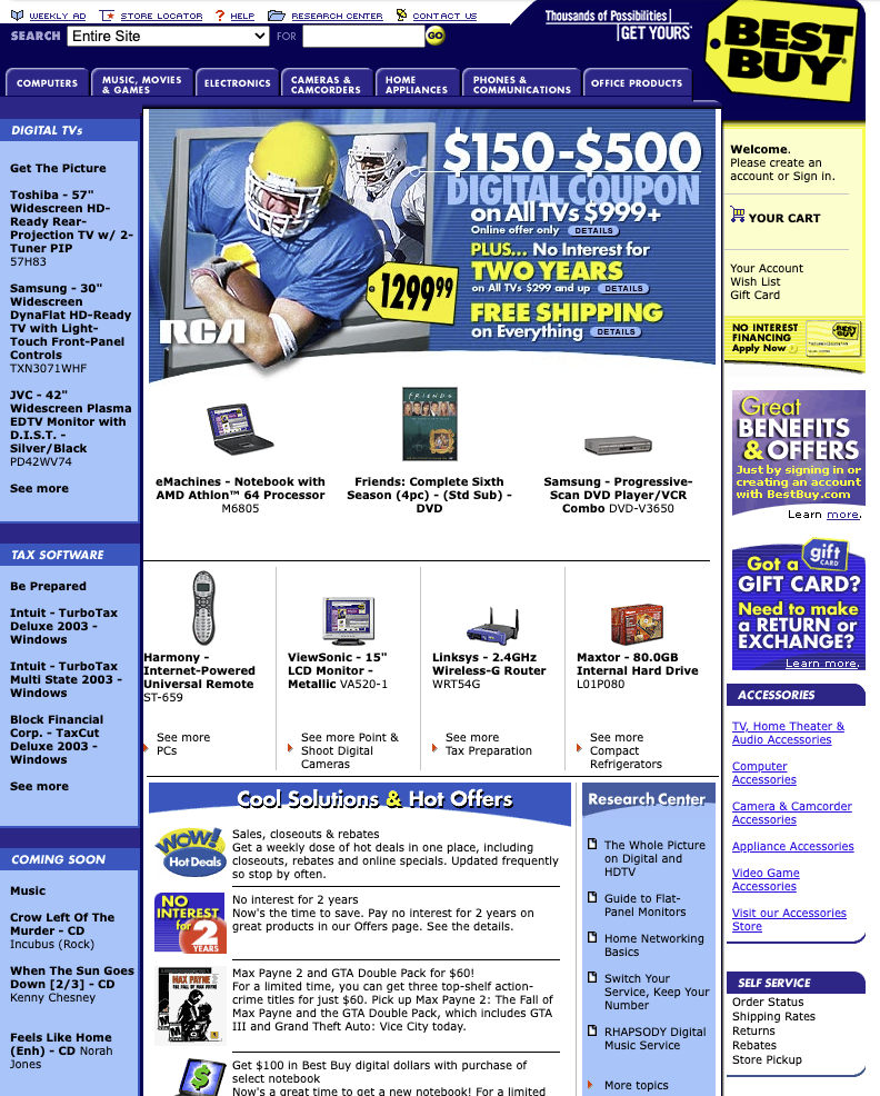
2002 – E-Commerce Revolution:
Best Buy’s website continued to evolve, with notable improvements in design and functionality. The logo underwent a transformation, growing larger and more legible, making it easier for users to identify the brand. However, the color choice remained unconventional, with a predominant light yellow background dominating the site’s aesthetic.
The separation of a distinct header became more pronounced, providing a clearer delineation between different sections of the website. A significant portion of the navigation was housed within a left-justified panel, reflecting the prevailing design trends of the early 2000s. Moreover, the homepage saw an increase in content, with a plethora of information and products for users to explore. Built using HTML and CSS, with a growing reliance on server-side scripting languages like PHP and ASP, the website demonstrated the ongoing evolution of web technology.
2004 – Enhanced User Experience:
In a bold move, the designer or developer of Best Buy’s website decided to shake things up by relocating the logo to the right side of the site, a departure from the traditional top-left placement. This unconventional decision was paired with the placement of the search bar in the left corner, a move that garnered attention for its unique approach to website layout.
The familiar Best Buy colors began to take center stage, bringing a sense of cohesion to the overall design. Images grew larger, contributing to a more visually engaging experience for users, while the layout became more organized, albeit still overwhelming with information. Some of the navigation elements migrated to the header, taking the form of tabs, further streamlining the user experience. Developed using a combination of HTML, CSS, and server-side scripting languages such as PHP and ASP, the website exemplified the technological advancements of the mid-2000s while setting the stage for future innovations in web design.
This website design can be considered dynamic, as it likely featured some level of interactivity and server-side processing to deliver dynamic content to users.
2007 – The Mobile Experience:
In this era of website evolution, Best Buy’s website experienced a renaissance of sorts. The logo made a triumphant return to its original position on the left side of the screen, reclaiming its status as a prominent brand identifier. However, the header saw a significant upgrade with a double layout of navigation, providing users with even more options for seamless navigation.
Graphics underwent a noticeable improvement, with sharper images and sleeker design elements contributing to a more polished aesthetic. Developed using a combination of HTML, CSS, JavaScript, and server-side scripting languages like PHP and ASP, the website embraced the latest technologies of the time to deliver an enhanced user experience.
With the rise of smartphones, exemplified by the introduction of the Apple iPhone in the same year (2007), Best Buy adapted its website for mobile devices, optimizing the user experience for smaller screens. The mobile version of the site featured simplified navigation and streamlined content, ensuring seamless access to products and information on the go. This adaptation marked Best Buy’s commitment to staying ahead of the curve in an increasingly mobile-centric world, further solidifying its position as a leader in the retail industry.
2011 – The Era of Adaptation:
Best Buy entered a new phase of website evolution by embracing responsive design principles, marking a significant shift in its approach to online user experience. With the adoption of responsive design, Best Buy ensured that its website seamlessly adapted to different screen sizes and devices, providing a consistent and user-friendly experience across desktops, tablets, and smartphones. This strategic move catered to the evolving needs of today’s consumers, who increasingly relied on mobile devices for their online shopping needs.
Despite these advancements, Best Buy maintained its iconic logo on the left side of the screen, albeit scaled down in size to better harmonize with the evolving design aesthetic. The navigation underwent a simplification process, with a clean and straightforward layout in the top header, eliminating the need for secondary navigation on the left-hand side. The color palette transitioned to more muted tones, with shades of grey and navy blue dominating the interface, complemented by minimal yellow accents. This subtle yet impactful change contributed to a more sophisticated and modern visual appeal.
In terms of layout, Best Buy’s website underwent a significant overhaul, with a focus on decluttering and streamlining the user interface. The main banner on the homepage adopted a sliding format, allowing for the promotion of multiple products without overwhelming the page. White emerged as the predominant background color, providing a clean canvas to showcase products and reducing visual distractions. These strategic design decisions aimed to enhance the overall user experience and facilitate easier navigation and product discovery.
Technologically, Best Buy leveraged a combination of HTML5, CSS3, and JavaScript to implement responsive design elements seamlessly. These cutting-edge technologies empowered the website to dynamically adjust its layout and content based on the user’s device, ensuring optimal performance across a wide range of platforms. By embracing responsive design and incorporating the latest web development tools and techniques, Best Buy reaffirmed its commitment to innovation and customer satisfaction.
2016 – Personalization and Interactivity:
In 2016, Best Buy revolutionized its online presence by introducing personalized recommendations and interactive features to its website. Leveraging the power of data analytics, Best Buy aimed to deliver targeted content tailored to each user’s preferences and browsing history. This strategic move transformed the website into a dynamic and engaging platform, fostering deeper connections with customers and driving increased sales and engagement.
Technologically, Best Buy embraced advanced data analytics tools and algorithms to analyze user behavior and preferences, allowing for the generation of personalized recommendations in real-time. Additionally, interactive features such as product demos, virtual tours, and customer reviews were integrated into the website, enriching the browsing experience and encouraging deeper engagement with the brand.
As part of the website enhancement, the header underwent a redesign, adopting a sleek and modern aesthetic characterized by a predominantly navy color scheme with white typography. This updated design not only aligned with contemporary design trends but also enhanced readability and visual appeal, ensuring a seamless browsing experience for users.
HTML5, CSS3, and JavaScript continued to play pivotal roles in the development of Best Buy’s website, enabling the seamless integration of personalized features and interactive elements. By harnessing the latest technologies and leveraging data-driven insights, Best Buy positioned itself at the forefront of digital innovation, setting new standards for personalized online shopping experiences in the retail industry.

2020 – Omnichannel Integration:
In 2020, Best Buy created a strategic initiative to seamlessly integrate its online and offline channels, heralding a new era of omnichannel commerce. The website emerged as a central hub for omnichannel interactions, providing customers with a unified shopping experience across multiple touchpoints.
Omnichannel commerce refers to the seamless integration of various sales and communication channels, such as online, offline, mobile, and social media, to create a unified and cohesive experience for customers. By adopting an omnichannel approach, retailers like Best Buy aim to break down silos between different channels and provide customers with consistent and personalized interactions regardless of how they choose to engage with the brand.
In line with this omnichannel strategy, Best Buy’s website underwent significant enhancements to facilitate seamless interactions between online and offline channels. Customers were empowered to research products online, make purchases in-store, and access support and assistance across various touchpoints, including the website, mobile app, and physical stores. This integrated approach not only streamlined the shopping journey but also fostered deeper engagement and loyalty among customers.
Visually, the website underwent a refresh to reflect Best Buy’s commitment to innovation and customer-centricity. The logo received a modern overhaul, transitioning from an icon based design within a sales tag to a sleek typography-based logo with a subtle yellow flag accentuating the word “Buy.” The header also underwent a transformation, evolving from a darker navy color to a brighter blue hue, imbuing the website with a fresh and vibrant aesthetic.
From a technological standpoint, Best Buy continued to leverage cutting-edge technologies such as artificial intelligence (AI), machine learning (ML), and big data analytics to enhance the website’s functionality and personalization capabilities. These technologies enabled Best Buy to deliver tailored product recommendations, personalized offers, and seamless omnichannel experiences, positioning the brand at the forefront of digital innovation in the retail industry.
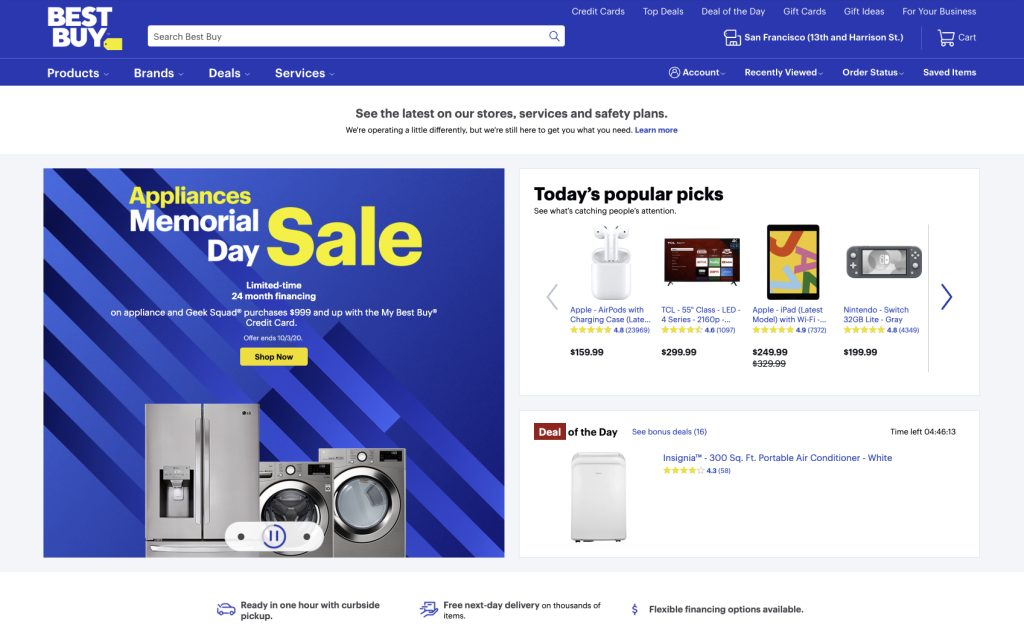
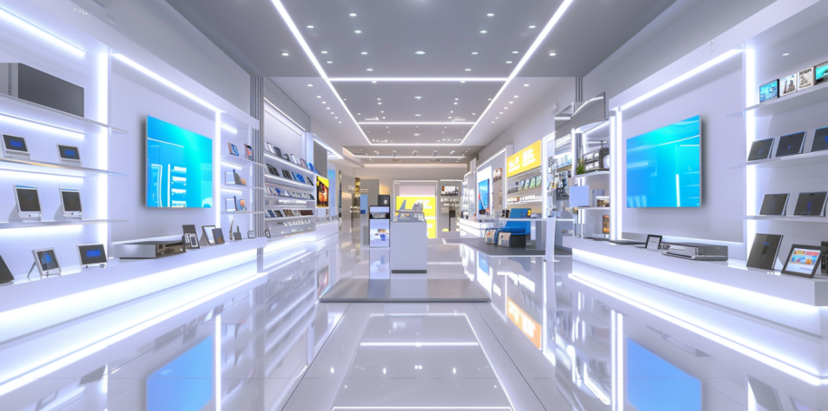
2024 – Cutting-Edge Innovation:
In the present day, Best Buy’s website stands as a beacon of innovation, continually pushing the boundaries of what’s possible in digital retail. Embracing the latest advancements in technology and design, the site harnesses the power of artificial intelligence, augmented reality, and other cutting-edge tools to create immersive shopping experiences like never before.
At a glance, visitors are greeted with a sleek layout that seamlessly integrates functionality and aesthetics. Above the header, a small ad captures attention, offering prime real estate for showcasing the latest promotions and deals. The header itself boasts a dynamic blend of navy and brighter blue hues, serving both as a navigational tool and a visual anchor.
But it’s not just about looks—behind the scenes, sophisticated algorithms and machine learning drive personalized recommendations and tailored experiences. A chatbot stands ready to assist shoppers, providing instant support and guidance as they browse the vast array of products and services.
This evolution is not merely cosmetic; it’s a reflection of Best Buy’s commitment to meeting the ever-evolving needs and expectations of today’s consumers. From static pages to dynamic e-commerce platforms to the personalized, omnichannel experiences of the present, Best Buy’s website epitomizes the transformative power of web design in shaping the future of retail.
In terms of technologies, Best Buy’s website at this time would likely incorporate advanced web development frameworks, AI-powered recommendation engines, augmented reality integrations, and sophisticated data analytics tools to deliver unparalleled user experiences.

As we reflect on Best Buy’s digital journey, we are reminded of the profound impact that web design and technology have had on the retail industry. From its humble beginnings to its current status as a retail giant, Best Buy’s website stands as a testament to the transformative power of innovation and adaptation.
As we continue to explore the Evolution of Websites, we are excited to witness how Best Buy—and other leading brands—will continue to shape the future of digital commerce, driving new trends and pushing the boundaries of what’s possible in the digital realm.
Join us on this journey as we uncover the past, present, and future of web design and technology, one website at a time.