Welcome to the first installment of our blog series, “Exploring the Evolution of Websites,” brought to you by Chico Web Design! In this series, we’ll take a trip down memory lane and examine the fascinating journey of top brands’ websites, analyzing how and why they’ve evolved over time. Through this exploration, we’ll delve into the evolution of web design and its impact on shaping the internet as we know it today.
To kick off our series, let’s take a closer look at one of the internet’s pioneers: eBay. With its inception in 1995, eBay quickly became a household name, revolutionizing the way people buy and sell goods online. Over the years, eBay’s website has undergone significant transformations, reflecting the evolution of web design and advancements in technology.
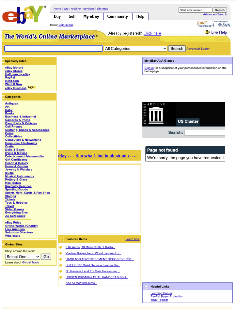
1999: Static Web Design
In the early days of the internet, eBay’s website featured a static design characterized by simple HTML pages with fixed content. The layout was basic, and navigation was straightforward, but the lack of dynamic elements limited user interaction and customization options.

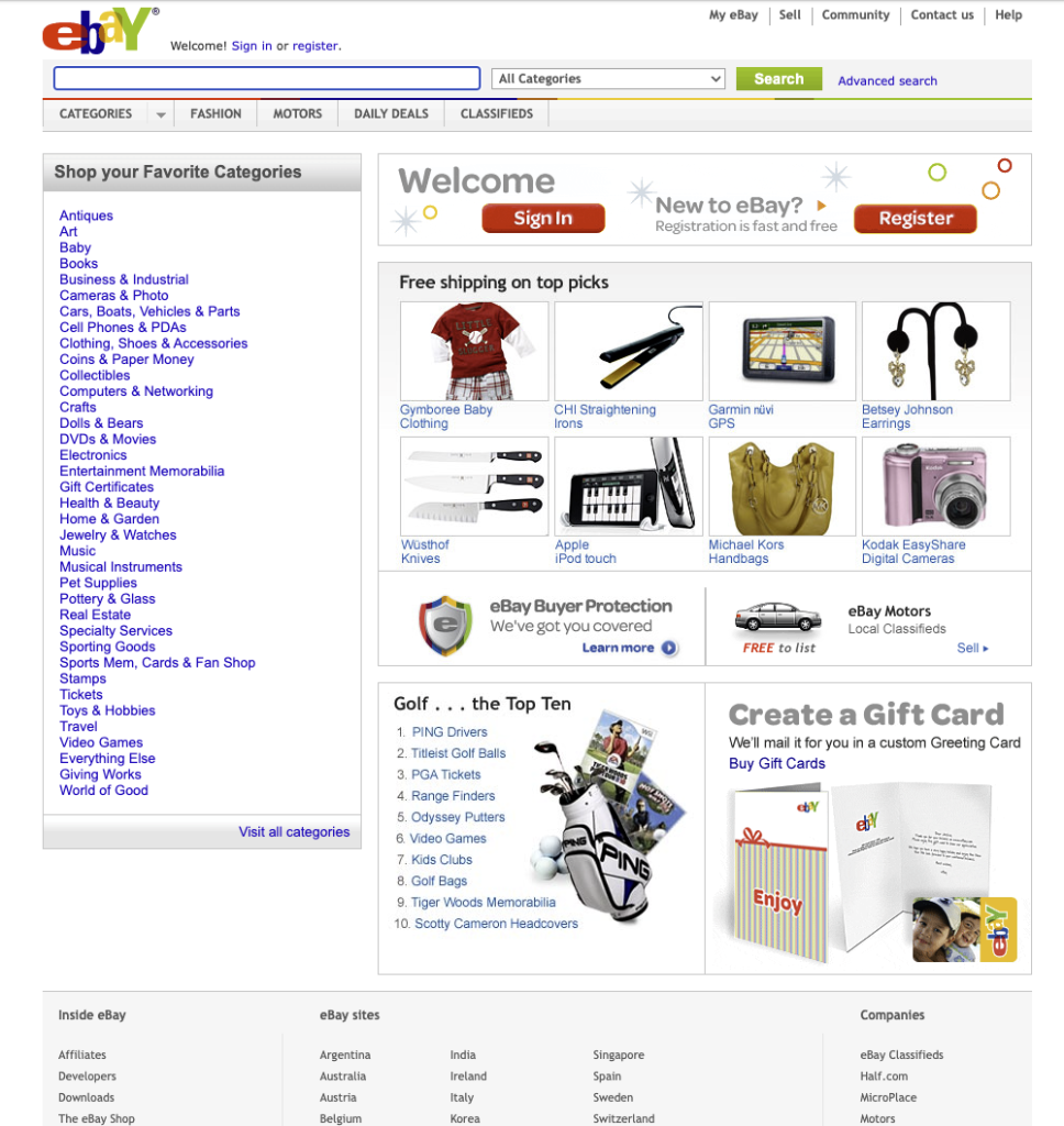
2005: Dynamic Web Design
By 2005, eBay had transitioned to a dynamic web design, incorporating server-side scripting languages and databases to create a more interactive and personalized user experience. Features like user accounts, search functionality, and dynamic product listings transformed eBay’s website into a dynamic online marketplace.

2010: Responsive Web Design
As mobile devices became increasingly prevalent, eBay embraced responsive web design to ensure optimal viewing experiences across all devices and screen sizes. By implementing fluid grids, flexible layouts, and media queries, eBay’s website became more accessible and user-friendly, catering to the growing number of mobile users.

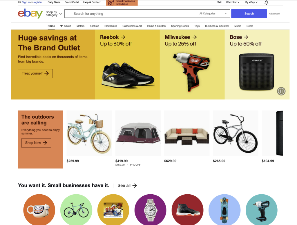
2015:
Enhanced User Experience In 2015, eBay focused on enhancing the user experience by introducing streamlined navigation, improved search functionality, and visually appealing design elements. The website’s interface became more intuitive and visually engaging, making it easier for users to find and purchase items.

2020:
Advanced Technology Integration With the rapid advancement of technology, eBay leveraged cutting-edge technologies like artificial intelligence, machine learning, and augmented reality to enhance the shopping experience further. Features like personalized recommendations, image recognition, and virtual try-on capabilities revolutionized how users interacted with the website.

2024:
eBay continues to innovate and push the boundaries of web design. Anticipated advancements include immersive experiences, voice user interfaces, and seamless integration with emerging technologies like virtual reality and blockchain. By staying at the forefront of innovation, eBay remains a leader in the ever-evolving land of e-commerce.

eBay’s website evolution mirrors the broader evolution of web design, reflecting advancements in technology, changing user preferences, and industry trends. By embracing dynamic, responsive, and innovative design principles, eBay has remained relevant and competitive.
Stay tuned for future installments of our “Exploring the Evolution of Websites” series as we continue to dissect the website histories of other top brands and uncover the fascinating stories behind their transformations. Until next time!

