Thinking about the concept of visual balance in a web design would be similar to that of physical balance on teeter-totter. Physical elements have weight that they needs to balance, well so do the elements of a web design. If the elements of a web design on either side of the layout are equal weight, then they balance each other out. There are two main forms of visual balance: symmetrical balance and asymmetrical balance.
Symmetrical Balance
Symmetrical balance or also known as formal balance occurs when the elements of a composition are the same on either side of an axis. If you were to look at a website that was symmetrically balanced you would see that on both sides the figures would be in similar positions and proportions. If you split the website in two both sides would look close, if not perfect, to being proportionately equal on each side. This photo of two fish, one lighter and one darker, illustrates this concept very well. This photo of a passageway with bare trees on each side, illustrates this concept very well. The trees are split perfectly down the middle making each side balanced equally. The trees look mirror images of each other, this shows that the photo is showing perfect symmetrical balance.

For web design, horizontal symmetry is applied to website layouts by centering content or balancing it between columns. Websites can have many different layouts but you want to make sure that the space on the page isn’t jumbled together, making different columns so that users are able to distinguish what content goes with which column. If the user isn’t able to figure out what content goes with each column you might have a problem with your spacing, there should be enough space between columns so that they are easily distinguishable.
Here is one of the websites that Chico Web Design designed for the Boys and Girls Club, this website is an example of horizontal symmetry. Notice the screenshot of the website, the picture in the middle splits the page right down the middle with one column on each side that balances each side. Then look at the bottom of the page at the three columns they have enough space in between each other to notice that there are three columns and if you were to split the middle column in half they would be even on each side. Even though there is a photo and columns below the layout still maintains the symmetrical balance.

There are two other forms of symmetrical balance but are less common in website design. They are, however, commonly used in logo and print design.
-Bilateral symmetry, which exists when a composition is balanced more than one axis.
– Radial symmetry, which occurs when elements are equally spaced around a central point.
Asymmetrical Balance
Asymmetrical balance or informal balance is a little more abstract and more visually interesting in general than symmetrical balance. Rather than mirror images on both sides of the website layout, asymmetrical balance involves objects of differing size, shape, tones or placement. These objects are arranged on a website so that, despite their differences, they equalize the weight of the website. For example if you have a large object on one side of the website and place several smaller objects on the other side, the website can still feel balanced.
The website Inman Group designed by Chico Web Design is a good example of asymmetrical balance. The first thing you notice on the left upper corner is the name of the company in a odd shape with another box with the contact us and the bottom there is content that goes two thirds of the page, on the right side the photo also goes two thirds of the page along with the navigational bar and there is a little column on the right side with company information. The two boxes in the left hand corner are balanced by the little box on the right side bottom corner with the navigational bar, photo and content evening out each side of the website layout.

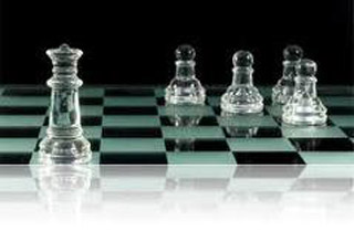
Take a look at the photo below of the chess game. We all know chess is an exciting game along with this photo that shows asymmetrical balance well. If you were to use something to cover any of the chess pieces it changes the photo, the entire photo would feel unbalanced and unfinished. This is a general concept of the way balance works. Its just like if you had a picture hanging from the wall by a single stud in the wall. If you were to shift the picture on either side barely, doesn’t take much, and the whole picture will be off balance.

Different from symmetrical balance, asymmetrical balance is more versatile and is used most often on the Internet. If you were to look at most two column website layouts, you will notice that the wider column is often lighter in color; a tactic that creates well contrast for the text and main content. The diminutive navigational column is often darker, has some sort of border, or is made to stand out in another way, in order to create balance within the layout.
